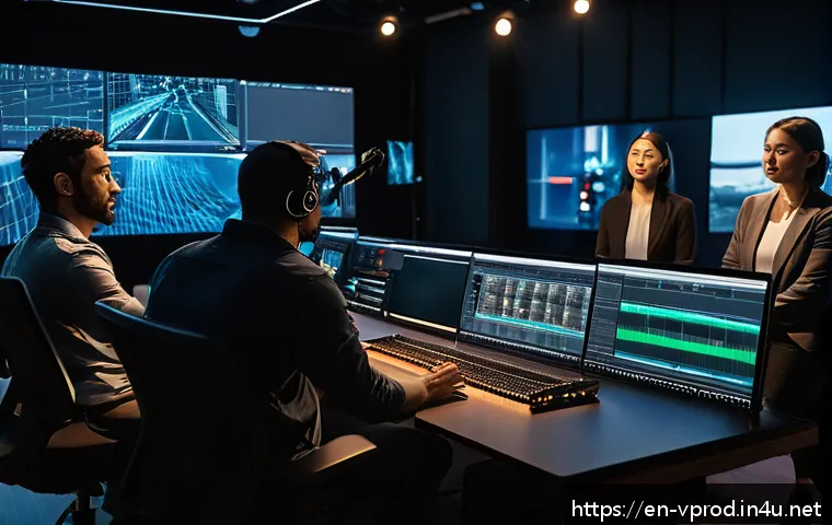
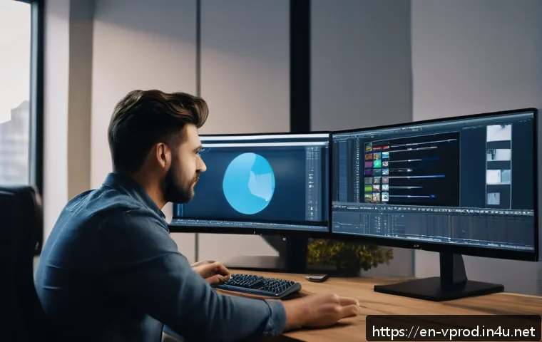
Creating captivating videos goes beyond just shooting footage—it starts with solid graphic design fundamentals. Understanding color theory, typography, and composition can dramatically elevate your visuals and keep your audience engaged.
Whether you’re crafting intros, overlays, or motion graphics, these basics form the backbone of professional-looking content. As video trends evolve with new tools and platforms, mastering graphic design principles ensures your work stays fresh and impactful.
Curious to unlock these essential skills and make your videos stand out? Let’s dive in and explore the core elements together!
Mastering Color to Set the Mood
How Color Influences Emotion and Attention
Color isn’t just about making your video look pretty; it’s a powerful tool that taps directly into your audience’s emotions. For instance, warm colors like reds and oranges can evoke excitement or urgency, which is perfect for fast-paced action scenes or call-to-action overlays.
On the other hand, cool blues and greens tend to calm viewers, making them ideal for storytelling or educational content. When I started experimenting with color palettes intentionally, I noticed viewers lingered longer on my videos, probably because the mood felt just right.
It’s about creating a subconscious connection that keeps people watching.
Choosing the Right Palette for Your Brand
Your color choices should feel consistent and reflect your brand’s personality. If your channel is all about high energy and fun, bold and saturated colors work wonders.
But if you’re producing sleek, professional tutorials, a more muted, harmonious palette feels trustworthy and clean. I like to use online tools like Adobe Color or Coolors to generate palettes that complement my logo and overall vibe.
It’s a small step that pays off big when it comes to brand recognition and viewer loyalty.
Balancing Contrast for Readability
A classic mistake I used to make was not thinking enough about contrast. When text or graphics don’t stand out against the background, viewers get frustrated trying to read or understand the message.
High contrast between elements—like white text on a dark background or vice versa—makes everything pop. But watch out for extreme contrasts that strain the eyes; subtle gradients or shadowing can add depth without overwhelming viewers.
Playing with contrast is especially crucial for overlays and lower-thirds that appear briefly but must convey information instantly.
Typography That Speaks Louder Than Words
Picking Fonts That Match the Video’s Tone
Typography is more than just choosing a pretty font; it’s about communication. A playful font with rounded edges can make your video feel approachable and casual, while a sleek sans-serif font screams professionalism and modernity.
I’ve learned that mixing two complementary fonts—one for headings and another for body text—creates visual hierarchy that guides the viewer’s eye naturally.
Just make sure you avoid overly decorative fonts for long text, as they can be distracting or hard to read on small screens.
Hierarchy and Spacing for Clear Messaging
Hierarchy in typography is like giving your viewers a roadmap. Bigger, bolder fonts signal headlines or important points, while smaller fonts deliver supporting details.
Don’t underestimate the power of spacing—between letters, lines, and paragraphs. When I first started adjusting kerning and line height, my text looked way cleaner and easier to digest.
Poor spacing feels cramped and messy, which can turn viewers off in seconds, especially on mobile devices where screen real estate is tight.
Responsive Typography for Different Platforms
Different platforms have different requirements. A font size that works on YouTube’s big screen might look tiny on Instagram Stories or TikTok. I always preview my videos on multiple devices to ensure text remains legible.
Sometimes, it means tweaking font size or weight depending on where the video will live. This adaptability not only improves viewer experience but also reflects a professional approach that stands out in crowded feeds.
Composition Techniques to Guide the Viewer’s Eye
The Rule of Thirds for Balanced Frames
One of the simplest yet most effective composition rules is the rule of thirds. Imagine dividing your frame into nine equal parts with two vertical and two horizontal lines.
Positioning your subject or key graphics along these lines or intersections creates natural balance and draws attention exactly where you want it. I started using this guideline religiously in my editing software, and suddenly, my shots felt more dynamic and less “flat.” It’s a subtle trick that enhances storytelling without flashy effects.
Leading Lines and Visual Flow
Leading lines are visual pathways that direct the viewer’s gaze through your frame. They can be literal, like roads or railings, or implied, like a person’s gaze or a sequence of objects.
When you use leading lines intentionally, you create a smooth flow that keeps viewers engaged and focused on the story or message. For example, in an intro graphic, arrows or curves can subtly guide attention toward your logo or call-to-action button, making the video feel polished and purposeful.
Negative Space: Letting Your Design Breathe
Negative space, or the empty area around your elements, is often overlooked but crucial. It prevents your visuals from feeling cluttered and gives the viewer’s eye room to rest.
I used to cram every inch of my frames with text and graphics, thinking more information meant better engagement. But what I found was the opposite—too much going on overwhelmed viewers.
By embracing negative space, your key elements shine brighter and your videos come across as more elegant and thoughtful.
Motion Graphics: Adding Life and Clarity
Animating with Purpose, Not Just Flash
Motion graphics shouldn’t just dazzle; they need to clarify and enhance the story. When I started adding animated lower-thirds or transitions, I made a point to use movement that supported the message.
For example, a subtle fade-in for a name tag feels natural, while a jittery bounce might distract from serious content. The goal is to use animation to guide attention without overwhelming the senses.
Timing and Pace for Smooth Visual Flow
The speed of your animations can make or break viewer experience. Too slow, and the video drags; too fast, and viewers might miss important info. I learned this the hard way after rushing through a tutorial intro, only to get comments saying it was confusing.
Now, I time animations to complement voiceovers or music beats, creating a rhythm that feels intuitive and engaging. It’s all about pacing that respects the viewer’s ability to absorb content comfortably.
Consistency Across Video Elements
Consistency builds professionalism and trust. I always stick to the same animation style, easing in and out, and color schemes throughout a video or series.
This creates a cohesive look that viewers subconsciously appreciate. Jumping between wildly different styles makes content feel disjointed and less credible.
So, before diving into motion design, define your style guide and keep it tight.
Practical Tools and Resources for Beginners
Graphic Design Software Options
For those new to graphic design in video, choosing the right software can be overwhelming. I started with Adobe Photoshop and Illustrator for static design elements, then moved to After Effects for motion graphics.
But if you’re looking for something more accessible, tools like Canva and Adobe Spark offer user-friendly interfaces perfect for beginners. Experimenting with a few options helped me find what suited my workflow best.
Free Resources to Enhance Your Projects
You don’t always need a big budget to create stunning graphics. Websites like Unsplash and Pexels provide free high-quality images, while Google Fonts offers a vast collection of free typography.
I also rely on free icon libraries like Flaticon to add subtle accents without reinventing the wheel. Using these resources smartly saved me hours and made my videos look polished from day one.
Learning Platforms to Level Up Quickly
Online courses and tutorials can fast-track your skills. Platforms like Skillshare, Udemy, and YouTube have excellent content focused on graphic design for video creators.
I’ve personally found following project-based tutorials helpful—they give you a hands-on approach rather than just theory. Investing a few hours each week in learning new techniques kept my content fresh and relevant as trends evolved.
Key Design Principles at a Glance
| Design Element | Purpose | Common Mistakes | Tips for Success |
|---|---|---|---|
| Color | Set mood and evoke emotion | Using clashing colors, ignoring contrast | Choose palettes that match brand and maintain readability |
| Typography | Communicate tone and hierarchy | Overusing decorative fonts, poor spacing | Mix 2 fonts max, adjust spacing for clarity |
| Composition | Guide viewer’s eye and balance frame | Cluttered layout, ignoring negative space | Apply rule of thirds, embrace empty space |
| Motion Graphics | Enhance storytelling and engagement | Overly flashy animations, inconsistent style | Animate purposefully, keep style consistent |
| Tools & Resources | Facilitate design creation and learning | Using overly complex software too soon | Start simple, use free assets, keep learning |
Adapting Design for Emerging Video Trends
Vertical Video and Mobile-First Design
With platforms like TikTok and Instagram Reels dominating, vertical video has become the norm rather than the exception. This shift requires rethinking your graphic layouts—what works in a horizontal frame might feel cramped or awkward vertically.
I had to redesign my intros and overlays to fit smaller screens and vertical orientation, focusing on large, bold text and minimal clutter. Prioritizing mobile-friendly design ensures your content stays accessible and engaging wherever viewers watch.
Incorporating Interactive and AR Elements
Augmented reality and interactive graphics are gaining traction in video content, especially in marketing and live streams. While these might seem advanced, even beginners can experiment with simple interactive annotations or AR filters using tools like Spark AR or Lens Studio.
I tried adding clickable overlays during live product demos, and the engagement boost was noticeable. Staying ahead with these trends can set your videos apart in a crowded digital landscape.
Keeping Up with Platform-Specific Guidelines
Each social media platform has its own quirks regarding graphic sizes, safe zones, and text limits. Ignoring these can lead to cropped or unreadable content.
For example, YouTube thumbnails require a different approach than Facebook cover videos. I keep a quick-reference guide handy for all platforms I target, which saves me from last-minute scrambles and ensures my visuals always look sharp and professional.
Creating a Cohesive Visual Identity for Your Channel
Consistent Branding Across Videos
Consistency is the secret sauce behind memorable channels. From color schemes to typography and logo placement, maintaining uniformity helps your audience instantly recognize your content.
When I started applying a strict brand style guide across all my videos, engagement and subscriber growth noticeably improved. It builds trust and makes your channel feel polished and reliable.
Using Templates to Save Time and Maintain Quality
Templates are lifesavers, especially when you’re juggling multiple projects or tight deadlines. Creating or purchasing templates for intros, lower thirds, and transitions lets you focus on content rather than reinventing the wheel each time.
I customize my templates slightly for each video to keep things fresh while preserving overall brand consistency. It’s a huge productivity boost without sacrificing quality.
Soliciting Feedback to Refine Your Look
Sometimes we get too close to our work and miss obvious design flaws. Sharing your videos with trusted peers or your audience for feedback can reveal blind spots.
I’ve found that constructive criticism on graphic elements helped me fine-tune colors, font sizes, and animation speeds to better match viewer preferences.
This iterative process is key to evolving your visual identity organically and effectively.
Wrapping Up
Mastering design elements like color, typography, and composition is essential for creating videos that truly connect with your audience. Thoughtful use of motion graphics and adapting to new trends can elevate your content’s professionalism and engagement. Remember, consistency and continuous learning are key to developing a strong visual identity that viewers recognize and trust. With these insights, you’re well on your way to crafting videos that not only look great but also communicate effectively.
Handy Tips to Remember
1. Choose color palettes that evoke the right emotions and align with your brand personality to keep viewers engaged longer.
2. Use typography that supports your video’s tone, and pay attention to spacing and hierarchy for clearer messaging.
3. Apply composition techniques like the rule of thirds and embrace negative space to create balanced and inviting visuals.
4. Animate with purpose—keep motion graphics subtle and consistent to enhance storytelling without distraction.
5. Always test your designs across multiple platforms and devices to ensure readability and professionalism.
Key Takeaways for Successful Video Design
Effective video design hinges on creating emotional connections through color and clear communication via typography and layout. Avoid clutter by balancing elements and using negative space wisely. Purposeful motion graphics and adapting to platform-specific needs keep your content fresh and accessible. Consistency in branding and openness to feedback foster trust and help refine your style over time. Starting simple and utilizing free resources can accelerate your growth without overwhelming your workflow.
Frequently Asked Questions (FAQ) 📖
Q: How does understanding color theory improve my video graphics?
A: Grasping color theory helps you create visuals that evoke specific emotions and reactions from your audience. For example, warm colors like reds and oranges can energize viewers, while cool blues and greens tend to calm and soothe.
When I started applying complementary colors in my video overlays, I noticed my audience stayed engaged longer because the visuals felt more harmonious and intentional.
It’s not just about picking pretty colors—it’s about crafting a mood that supports your story and brand identity, making your videos far more memorable.
Q: What role does typography play in video design, and how can I use it effectively?
A: Typography is crucial because it guides how your message is read and perceived. Choosing the right font style, size, and spacing can either enhance clarity or confuse viewers.
From my experience, simple sans-serif fonts work best for on-screen text since they’re easier to read quickly. Also, pairing fonts thoughtfully—like using a bold font for headlines and a clean, lighter font for subtitles—adds professionalism and keeps viewers focused.
Remember, typography isn’t just decoration; it’s a communication tool that supports your video’s flow and impact.
Q: Why is composition important in creating professional-looking videos?
A: Composition is the art of arranging visual elements in a way that directs attention and creates balance. When I started applying basic composition rules like the rule of thirds or leading lines, my videos instantly looked more polished.
It helps you avoid clutter and ensures that key elements—whether text, graphics, or footage—stand out clearly. Good composition makes your videos easier to watch and more engaging because viewers naturally follow the visual path you set, which ultimately boosts retention and viewer satisfaction.